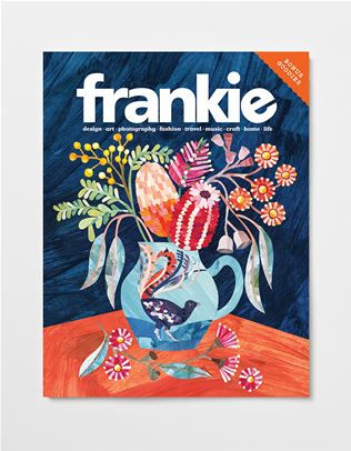
a chinwag with esther sandler
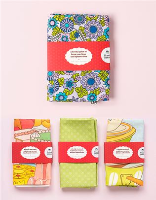
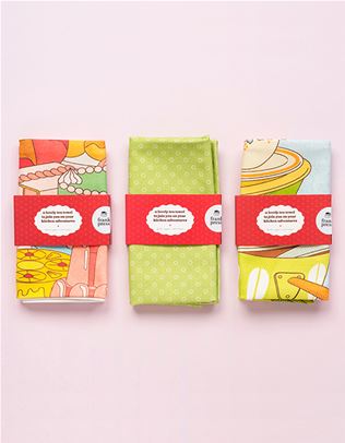
Creative boffin and head honcho of dreamy label Togetherness Design Esther Sandler knows a thing or two about the natural wonders of our world. Her designs are brimming with a playful sense of nature, drawing on imagery of pretty flowers and cheeky animals. While this month’s subscriber-only goodie card is adorned with the former – hello spring! – Togetherness’ latest collection of wares embraces the latter. Titled ‘Hobby Farm’ and on sale from October 2nd, Esther’s newest designs explore the slow and steady life of a small farm, all while maintaining the carefully considered quality that Togetherness Design is known for.
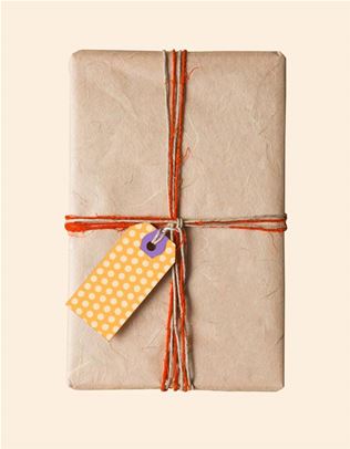
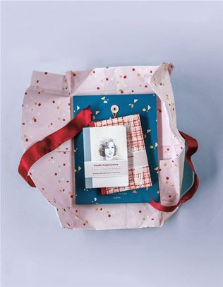
Plus, frankie fellows are treated to 20 per cent off Togetherness Design from now until October 31st, 2025, with the code FRANKIEFRIENDS. In the meantime, you can catch us falling into the cloud of florals Esther has created for us on her dreamy card.
Tell us about how you created this special print for frankie subscribers. My Hyperfloral design started as a small painting in my sketchbook, about A5 size, and evolved into a repeating textile design for my label Togetherness. Once the painting was finished, I scanned it and edited it digitally to put it into a repeat. It was a fun process of taking something small and personal and transforming it into something bold and wearable.
View this post on Instagram
Do you have a medium that you’re most drawn to? I’m most drawn to painting, especially with gouache or watercolour on lovely, high-quality watercolour paper (what a treat!). When I'm in a good flow state, time just slips away and I can work on something for a few hours without taking a break. But it's not always this magical – sometimes an idea doesn't quite take shape and that can be quite frustrating, too.
Within my personal work at the moment, I'm also embracing hand-knitting and have been doing a lot of this over the winter months at the end of the day with a good TV show on.
How do you begin the process of crafting one of your designs? I usually begin with rough sketches with a pencil and eraser. Or, for more formal pieces, I will do this digitally. Once the design is complete, I'll transfer it onto my surface with carbon paper. I then erase back most of the design so that it's not as prominent when I begin painting – but I normally do a pretty bad job of this so you'll always end up seeing pencil marks in my final painted pieces (which I feel is part of the charm).
Then comes my favourite part – painting! I mainly use gouache because it’s so versatile as it can be opaque and also give a watercolour look. I’ve never felt like I was a proper painter or drawer, so I like to approach it like I’m just ‘colouring in’ as it helps takes the pressure off and lets me enjoy the process.
View this post on Instagram
How does designing prints change when you’re designing them for textiles, as opposed to paper? The process is quite similar at the start, but the final result can vary quite a lot. Printing onto fabric tends to capture the original colours a lot better and you can achieve really vibrant and bright colours. However, the textured surface of fabric means that really small details tend to get lost. Designing for paper requires a bit more precision. When artwork is printed onto paper, working in CMYK colour mode means that colours can change from my bright, vibrant original painted pieces to be slightly duller, and small details (and mistakes!) can be captured on the surface.
Where do you look to for inspiration when you’re stuck in a slump? Nature is my biggest source of inspiration and it’s the best medicine for me when I am in a creative slump – whether that means going for a bushwalk, looking at some flowers or having a picnic in the park. As well as being good for my mental health, I feel like it helps to blow away all the cobwebs and helps me reconnect with what I really love.
Also, when I’m feeling blocked, I’ll often revisit my design heroes – people like Maija Isola, Gunta Stölzl and Sonia Delaunay. Their work always grounds me and reminds me why I do what I do. I also love going on deep dives into vintage textiles, homewares or children’s book illustrations as there’s so much interesting and weird work out there to be inspired by.
View this post on Instagram
How does your work at Togetherness Design intersect with your own creative work? From the outside, they’re very similar, but for me, Togetherness is slightly more commercial and designed with others in mind. When I create my personal illustrations or craft pieces, I am designing completely for myself. I’m also designing without the need to consider what product the artwork might have to work with. So, it's a space where I feel very free to explore any little idea that I have, and also explore different mediums that are potentially more time-consuming.
What is one thing you wished you knew at the start of your design career? When I started out, I had this idea that one day I’d feel like I’d ‘made it’ – like everything would fall into place and I’d have it all figured out. I wish someone had told me that this moment doesn’t really exist and that things are always evolving. I feel like everything is still a bit of a work in progress and I'm still discovering and refining my signature style – I'm sure I will continue to do this for the rest of my career!
But the difference of where I am now to where I was when I was staring out 15 years ago is that I feel more confident with what I like, what I don’t like, and what feels true to me. Even so, every new design or collection I put out still feels scary and I'm always crossing my fingers that people will resonate with what I'm doing.


.png&q=80&h=682&w=863&c=1&s=1)
.jpg&q=80&w=316&c=1&s=1)
.jpg&q=80&w=316&c=1&s=1)